It’s hard not to feel cheerful while strolling through a farmers market. Rows of bright vegetables, the smell of herbs in the air, and those quirky “Tomatoes with Personality” signs. But beneath all that charm is some serious science—specifically, the science of color psychology in produce packaging at farmers markets.
Let’s explore how the shade of a label or the hue of a produce bag helps your product stand out from the crowd.
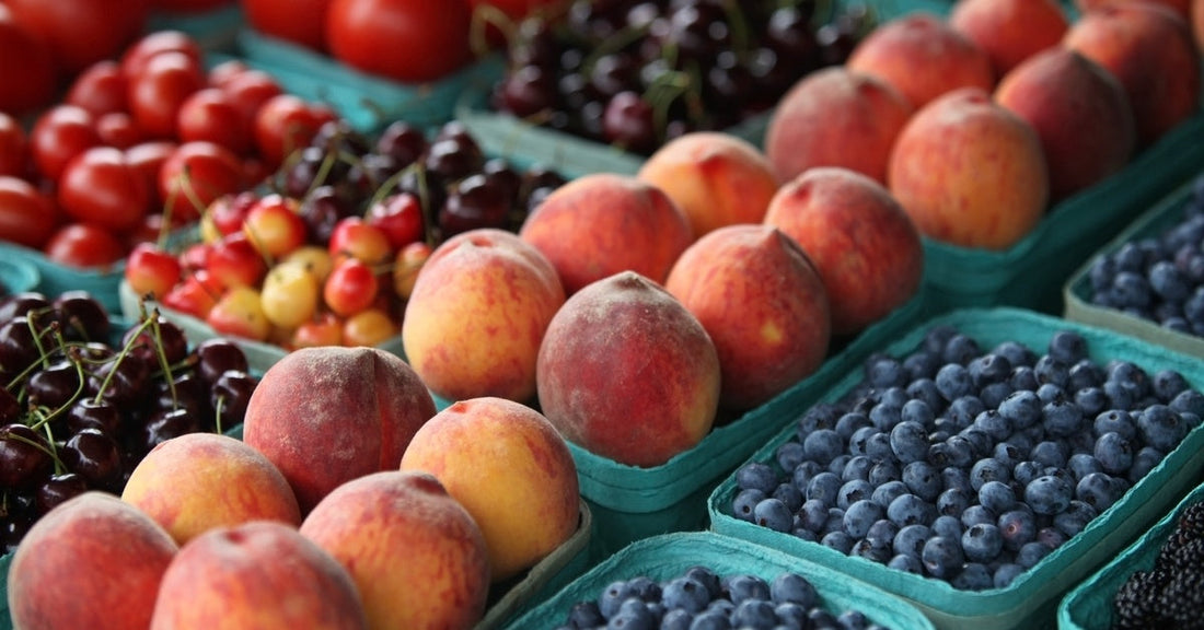
Warm Colors Invite Action
Red, orange, and yellow aren’t just the colors of autumn. They’re attention-grabbers! These shades stimulate appetite, evoke excitement, and convey freshness and warmth. Those red tomatoes in the red-trimmed baskets? Suddenly, they look juicier.
Orange is particularly popular for packaging potatoes and root vegetables. When paired with natural tones, it gives off a down-to-earth, just-harvested feel. It’s no wonder that many wholesale potato bags feature warm color palettes. They suggest both comfort and quality in a glance.
Cool Tones Build Trust
On the flip side, cool tones like green and blue can suggest cleanliness, trust, and even eco-consciousness. Green, of course, is a natural go-to for anything organic, leafy, or good for your cholesterol. It says, “I’m healthy and possibly grown by someone named Herb.”
Blue is less common in fresh produce, but when used intentionally, it can make a product seem premium or calming. A navy accent or icy-blue font on packaging elevates perception, especially when targeting more health-conscious or upscale shoppers.
Earthy and Neutral Feels Homegrown
Brown kraft paper, beige mesh, and soft grays all give off rustic, handmade vibes. These neutral tones tell shoppers that what they’re buying was pulled from the ground, not a warehouse. They’re remarkably effective when paired with tactile elements like twine, stamps, or handwritten labels.
That’s part of why you’ll often see apples in soft brown or off-white paper bags. When shoppers feel something is genuine, they’re more likely to buy and come back next weekend.
The Magic of Contrast
You can have the best-grown produce in the state, but if your display blends into the booth next door, you’re missing out. That’s where contrast comes in. A deep purple cabbage next to a white crate? Stunning. Bright green apples against a black chalkboard? Irresistible.
Color contrast in packaging works the same way. A pop of white ink on a brown sack. A teal sticker sealing a red mesh bag. These little choices help your products stand out while adding polish and personality.
Think in Color and Package Pith Purpose
If you’re already putting so much love into growing your produce, it only makes sense to give it a worthy stage. Color psychology in produce packaging isn’t about tricking anyone at the farmers market; it’s about telling a story with the right visual cues. Even something as simple as a strip of ribbon or a two-toned bag helps your display speak before you do.
For packaging that supports your story, from earthy and rustic to bold and brilliant, turn to Globe Bag Company. With reliable distribution, standout customer service, and a wide selection of packaging choices, we help farmers and vendors make the right first impression.